Project: Web Design
Contemporary Web Design For Contemporary Dance
The Brief
The Hofesh Shechter Company (HSC) wanted a new website that reflected their company, values and creative output. It needed to be a hub of activity that encompassed the vibrant and dynamic life of the company and all involved. As a contemporary dance company working in the creative arts, the website needed to be extremely design-focused. Our challenge was to extract their personality and artistic vision and channel that into the design. By having a website that truly reflects HSC, audiences get a real sense of what the company is about and the kind of experience they can have with HSC.

Setting the mood
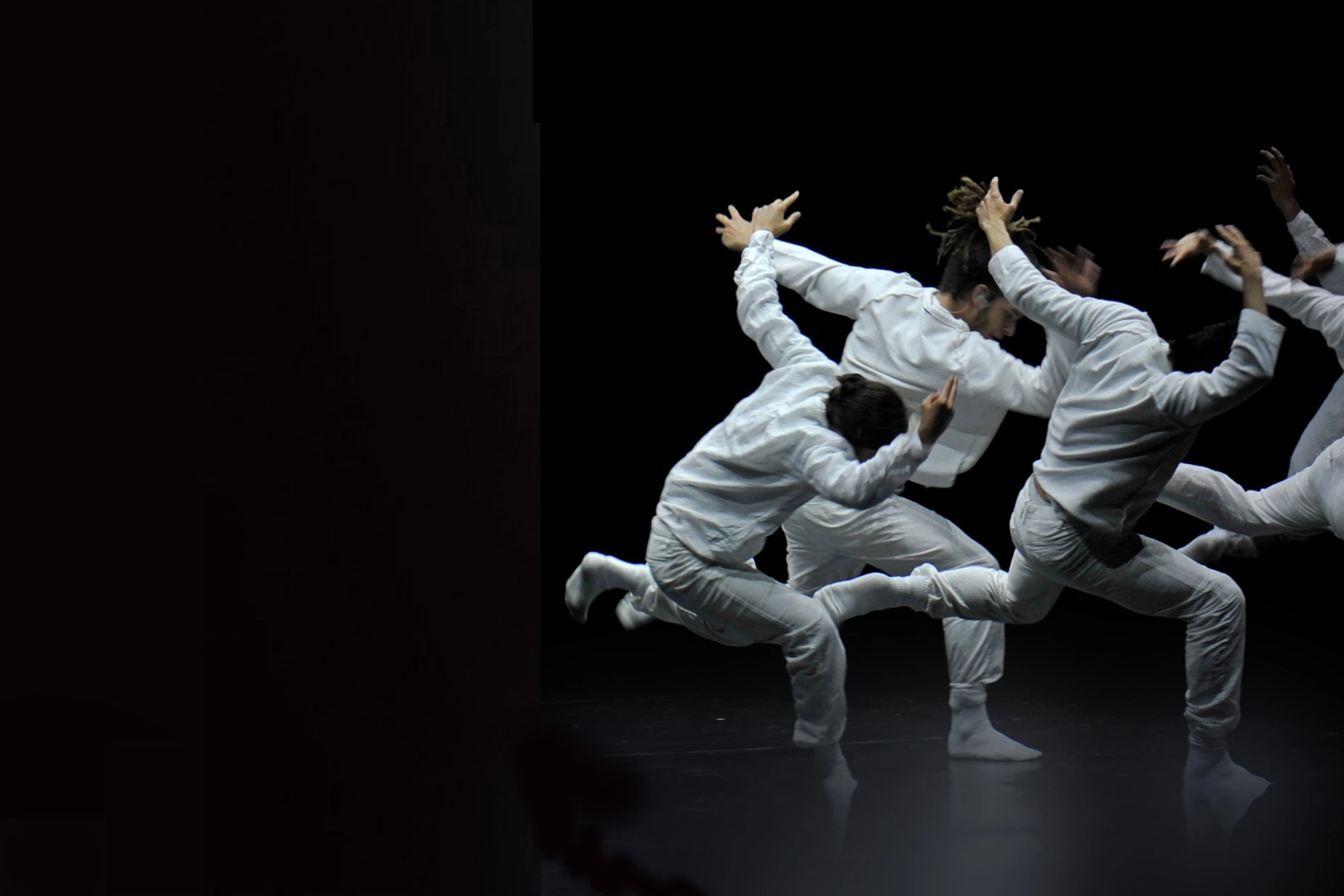
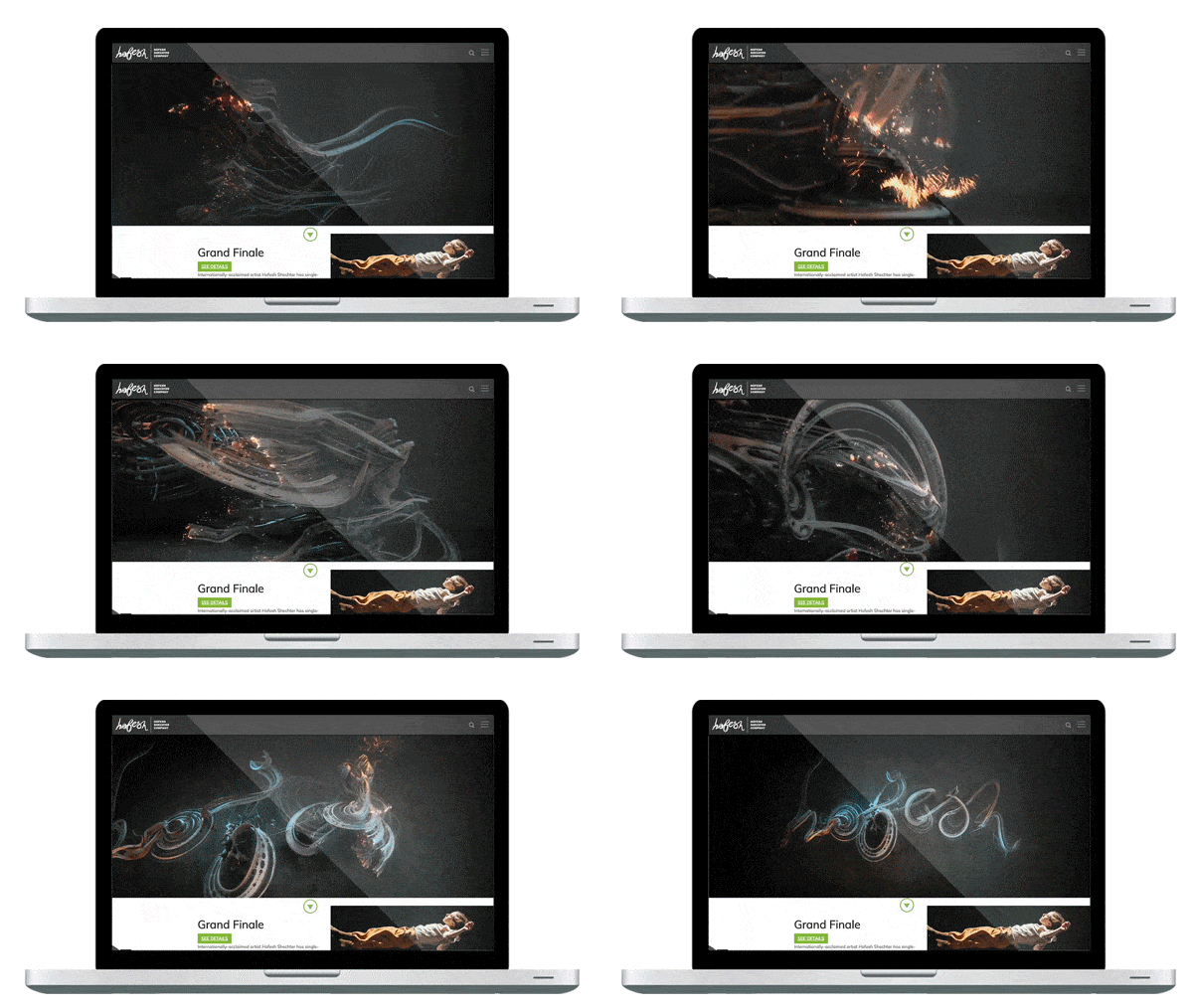
As an internationally renowned dance company, HSC wanted their website to create the right kind of online atmosphere for their global-reaching audience. To achieve this, we worked with the use of colour and texture to build a site that is gritty and has depth. Using contrasting branded elements like swirls, suggestive of movement, and block grid lines we enhanced and punctuated the website design with variety. By making use of a predominantly subdued colour palette, and adding moments of intense and vivid colour, the site is injected with a lively and unpredictable quality, reflective of the dance created by HSC.
Capturing the contemporary
Movement was vital to the creation of the HSC website, but it had to be implemented sensitively to prevent it distracting from the function of the site. As a website designed specifically for a dance company, videos of their work and rehearsals needed to be included at relevant points. Additionally, to include subtle movement we made use of parallax design and hover over effects across imagery. This also encourages users to interact and engage with core areas of the site.
The Result
An engaged online and offline audience
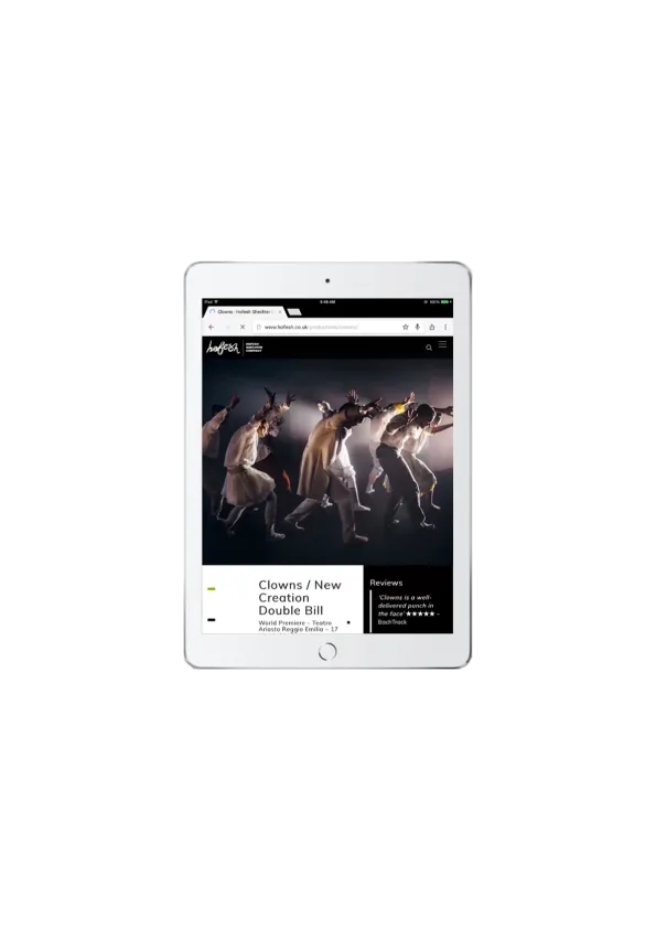
The HSC website now embodies the essence and unique experience of the company and its brand. By having a website that has been designed in partnership with the company and other brand elements, it has formed a consistent and seamless experience. But not only does the website look great, it’s also much more accessible and easy to navigate. With a clear and structured menu, users are now able to find what they are looking for quickly and have time to explore the website further. Content is grouped together according to relevancy, and users can traverse through the pages to expand their understanding of the company, discovering and engaging with HSC.
“Great service and lovely to deal with. We are very happy with the project that MRS delivered.”
Hofesh Shechter Company
